Our typographic system is built on legibility and accessibility. It’s clear, bold, and — when we use our international glyphs — endlessly expressive.

- We use SF pro text for most everything.
- We love localization, and have the guidelines and international fonts to prove it
- Before you type, kindly consider our casing and punctuation best practices
Our brand fonts are SF Pro text. The following tables outline how best to implement.
| Headline | ||
| Heading 1 | Font weight: Semibold Font size: 40px Line height: 48px | Torem ipsum dolor sit amet, consectetur |
| Heading 2 | Font weight: Semibold Font size: 32px Line height: 38px | Torem ipsum dolor sit amet, consectetur |
| Heading 3 | Font weight: Semibold Font size: 24px Line height: 28px | Torem ipsum dolor sit amet, consectetur |
| Heading 4 | Font weight: Semibold Font size: 18px Line height: 22px | Torem ipsum dolor sit amet, consectetur |
| Title | ||
| Title | Font weight: Semibold Font size: 24px Line height: 28px | Torem ipsum dolor sit amet, consectetur |
| subtitle | Font weight: Semibold Font size: 18px Line height: 22px | Torem ipsum dolor sit amet, consectetur |
| Body | ||
| Body/Semibold | Font weight: Semibold Font size: 16px Line height: 150% | Torem ipsum dolor sit amet, consectetur |
| Body/Regular | Font weight: Regular Font size: 16px Line height: 150% | Torem ipsum dolor sit amet, consectetur |
| Caption | ||
| Caption/14 | Font weight: Semibold/Regular Font size: 14px Line height: 150% | Torem ipsum dolor sit amet, consectetur Torem ipsum dolor sit amet, consectetur |
| Caption/13 | Font weight: Semibold/Regular Font size: 13px Line height: 150% | Torem ipsum dolor sit amet, consectetur Torem ipsum dolor sit amet, consectetur |
| Footnote | ||
| Footnote/12 | Font weight: Semibold/Regular Font size: 12px Line height: 150% | Torem ipsum dolor sit amet, consectetur Torem ipsum dolor sit amet, consectetur |
| Footnote/10 | Font weight: Semibold/Regular Font size: 10px Line height: 150% | Torem ipsum dolor sit amet, consectetur Torem ipsum dolor sit amet, consectetur |
We use SF Pro Text in our product and when creating product UIs for demos and marketing, with the exception of the localized languages noted below.


Capitalization and punctuation can be just as critical to copy as typography. The following offers an overview of our editorial style. For more details, see our writing guidelines.
Always default to sentence case for copy; use title case only for attributions and proper nouns. Reserve all-caps treatment for eyebrows and buttons, and never set type in all lowercase.
- Don’t use ampersands (&) or plus signs (+) in place of "and"
- Don’t use the Oxford/serial comma
- Use en dashes (–), not hyphens, for a span or range of numbers, dates or times
- Don’t use spaces around em dashes
- Set end punctuation inside closing quotation marks
Simplicity is best. Be mindful of the hierarchy between type style, size, weight and color. Enough variation provides a pleasant contrast. Too much becomes a distraction.

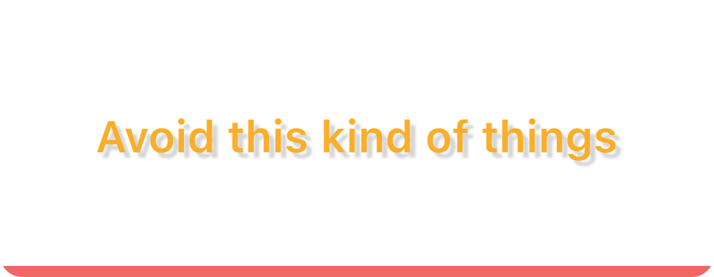
Don’t apply effects to type

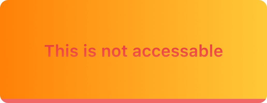
Don’t choose low-contrast text and background color combinations