Chances are you came to the brand center looking for this. It’s the face of our company, after all. Please handle with care.
Download logo- If you have permission to use our logo, please use these files and follow these guidelines—there's no need to recreate or reinvent anything
- Speaking of permission, don't use our logo in any advertising, apparel or merchandise without our approval
- We prefer to use our full logo in most situations
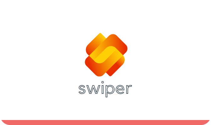
The logo for Swiper, an app centered around NFTs, technology, sports, and the future, features a distinctive design that holds significant symbolism. The logo overall conveys a sense of excitement, futuristic vision, and the cutting-edge nature of the Swiper app.
The logo comprises two stylized "Ss" stacked vertically on top of each other. This arrangement creates a dynamic and balanced visual representation. The gradient of vibrant yellow and orange colors employed in the logo reflects energy, enthusiasm, and innovation. The two stacked "Ss" symbolize both the name of the app and its core values.
Ideal clearspace is equal to the logo mark on each side.
It’s very unlikely you’ll need these, but we like to cover all the bases.
Use only where space constraints don't allow use of the horizontal logo.
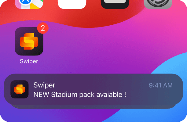
A specific small horizontal logo to use at a size between 50px and 90px wide. The small logo mark should be used at a size between 15px and 20px wide.
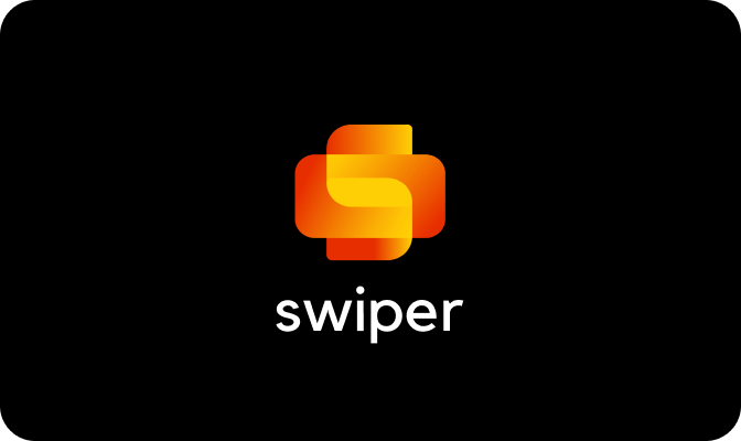
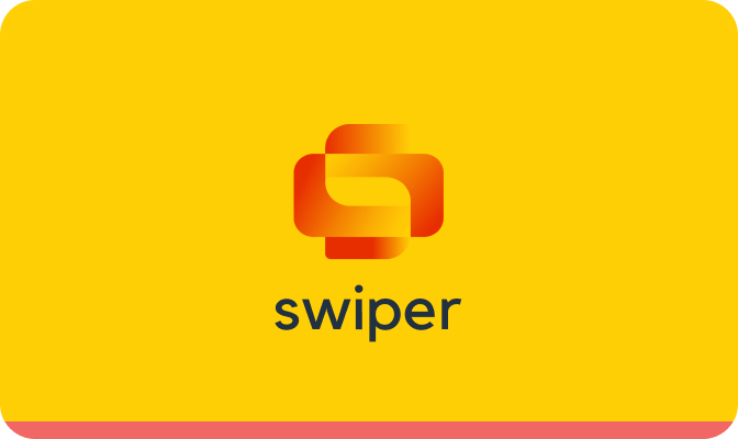
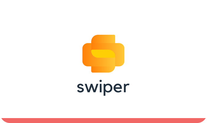
Our go-to version. Use it only with these backgrounds.
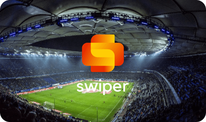
Observe our logo in the wild. It is small but mighty and signals a more pleasant work life is in store.
Don’t alter, crop, skew, outline, distort or recreate the logo in any way

Don’t use the full-color logo on an unapproved background color or low contrast photo
Don’t use the full-color logo on an unapproved background color or low contrast photo
Don’t display the Slack name without the logo mark

Don’t change the orientation of the logo mark
Don’t change the logo color