Our palettes unite our brand and allow us to express our personality.
- Accessibility is our priority, which is why we’ve picked out specific text and color pairings
- Aubergine is the most Slack color of all, but we also love horchata (who doesn’t?)
- Be mindful of the specificities of our secondary palette; namely please don’t use it for text
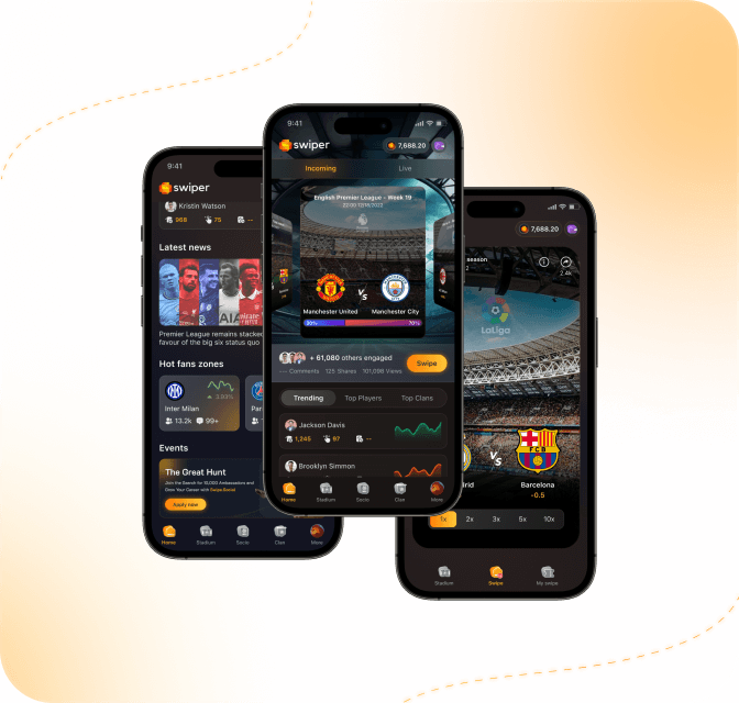
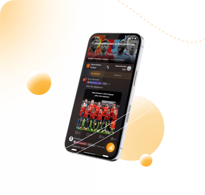
In the Swiper application, our core colors revolve around the vibrant and energetic shades of yellow and orange. These colors play a vital role in defining our brand's identity and creating a visually engaging experience for our users.

When it comes to color selection in the Swiper app, we value the significance of sematic colors in enhancing user experience and communication. We have carefully curated specific colors to convey meaning and provide visual cues throughout the application.
Each color is carefully used by us and has meaning
Content colors refer to the colors used to represent different types of content or information within a user interface or design. These colors are often chosen to create visual hierarchy, aid in organization, and enhance user experience.
Use to emphasise primary content in relation to other elements nearby.
Use for most body text, and in supportive elements that give context to content that's close to it.
Use in form inputs for placeholders, and for the label that says a field is ‘Optional’. Avoid using elsewhere.
Use for most body text, and in supportive elements that give context to content that's close to it.

Background colours are used for larger surface areas that are light enough to be overlayed with content and other components.
The lowest level background used in most screens.
Use for elevated surfaces that partially show the content behind it, like bottom sheets and sidebars.
Use for delineating areas without using borders, like neutral alerts and avatars.
Use for faintly darkening an area, for example on loading shimmers.
We use border colours to subtly separate different blocks of content.
Use in most separators, for example in the section header and tabs components.
Use on the edges of images to differentiate them from the background, such as flags in avatars.
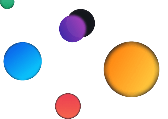
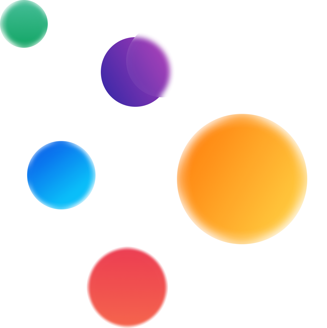
We use many gradient colors in the app. Each color has its own meaning and usage
- Gradient 1
- Gradient 2
- Gradient 3
- Gradient 4
- Gradient 5
- Gradient 6
- Gradient 7
- Gradient 8
- Gradient 9
- Gradient 10
- Gradient 11
- Gradient 12
- Gradient 13
- Gradient 14
- Gradient 15
The color represents the rarity of the item
- RarityCommonHexE9EAEC
- RarityUncommonHexA5D6A7
- RaritySpecialHex61B785
- RarityRareHex8CB5E3
- RarityEpicHex6680FF
- RaritySuperHexBD99FF
- RarityMagicHexB22EC2
- RarityHeroicHexCAAB05
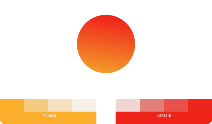
- RarityLegendaryHexFF9633
- RarityGOATHexEB4B4B
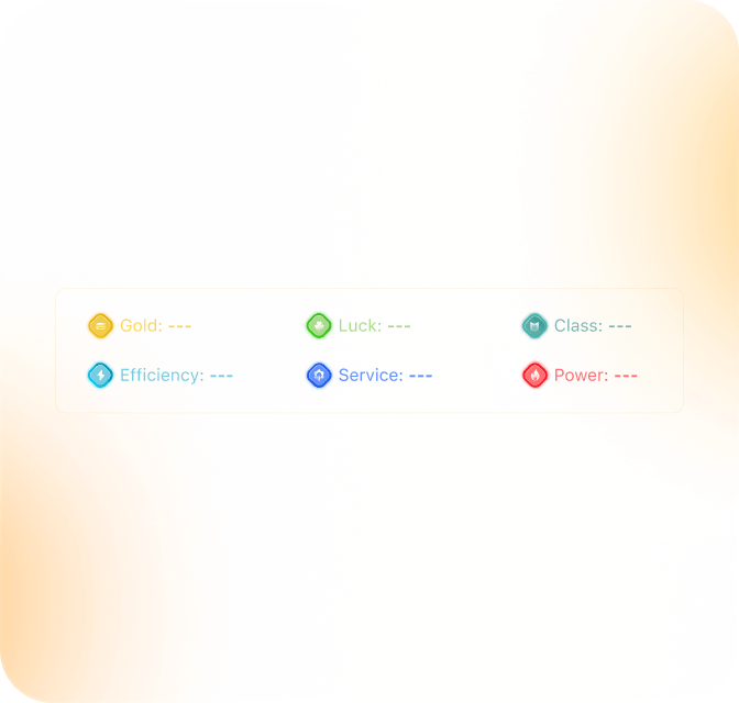
The way we categorize based on color
- ClassOffensiveHexFFF176
- ClassHomeHex81C784
- ClassNeutralHex4FC3F7
- ClassAwayHexE77E7E
- ClassDefensiveHexC37CCF
Stadium is one of the key components of our products, see how we play with their colors
- PartLandHexDEAC90
- PartFieldHex9BE18C
- PartLightHex9CB8F7
- PartTechnical areaHexFCD7A1
- PartPitchHexCCB0FB
- PartStandHexEF90C3
We use border colours to subtly separate different blocks of content.
Use for copy on negative buttons. Turns dark on dark mode to keep elements visible.
Use in informational or interactive elements where white is needed, or where other colours would be too prominent in the hierarchy.
Use in informational or interactive elements where a dark colour is needed.
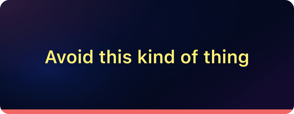
Explore how color comes to life and learn what to avoid.


Don’t use secondary colors for text
Don’t use overly muted color combinations
Don’t choose low-contrast text and background color combinations

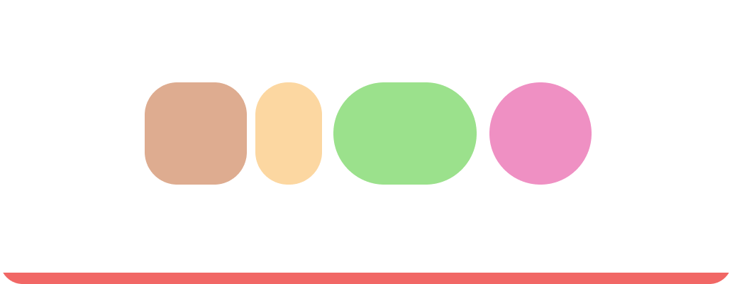
Don’t create gradients with our colors